Short Description
BankBlackUSA reached out to refresh their website and raise the brand's profile. The real work was to keep the meaning of the mark intact while making the digital experience useful enough to support a growing movement.


Case Study · BankBlackUSA
BankBlackUSA reached out to refresh their website and raise the brand's profile. The real work was to keep the meaning of the mark intact while making the digital experience useful enough to support a growing movement.
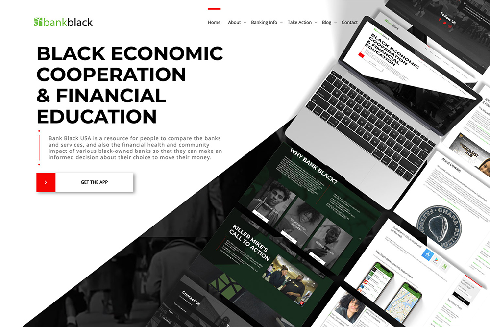
BankBlackUSA is an independent grassroots organization that formed out of the larger #BankBlack movement. It is not a bank. It is a source of information that helps people connect economic power to social and racial justice. The site needed to make that distinction clear, and the brand needed to feel as serious as the mission.
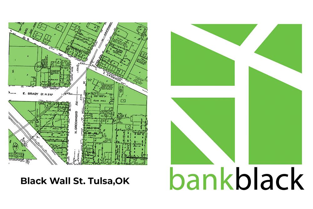
The logo mark is a stylized rendition of a topographical map of the original Black Wall Street. We cleaned it up without changing its meaning. Positioning did more of the work than decoration: the site had to communicate that BankBlackUSA is a resource, not a financial institution.
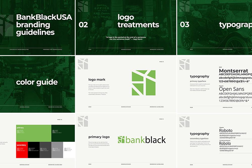
Photography became a bridge. Historical images that celebrate Black Wall Street sit alongside contemporary entrepreneurial portraits, shown in grayscale so the past and the present feel like one story. The color palette was limited to Pan-African flag colors and documented in brand guidelines so the system could be used consistently.
The site moved from Wix to WordPress, with a more maintainable structure, staff training, and a clearer way to present financial information.

This is the kind of problem a Website & Brand Transformation is built to solve: the business—or the movement—has outgrown the way it currently appears.