Case Study · Kappa Card

Simplifying networking down to a single scan

Product StrategyUX/UIWeb ApplicationDevelopment

Short Description

Members needed a simpler way to exchange complete contact information without downloading an app or manually sharing multiple social accounts.

I reframed the experience around the moment of introduction and designed a web-based contact-sharing platform.

The problem

The original request sounded like a product feature problem: people needed a better way to share contact details. The actual problem was social and situational. In the moment of introduction, nobody wants to download an app, hunt through profiles, or type information into a phone while the conversation is still happening.

If the solution required installation, it would fail at the exact moment it was needed.

The approach

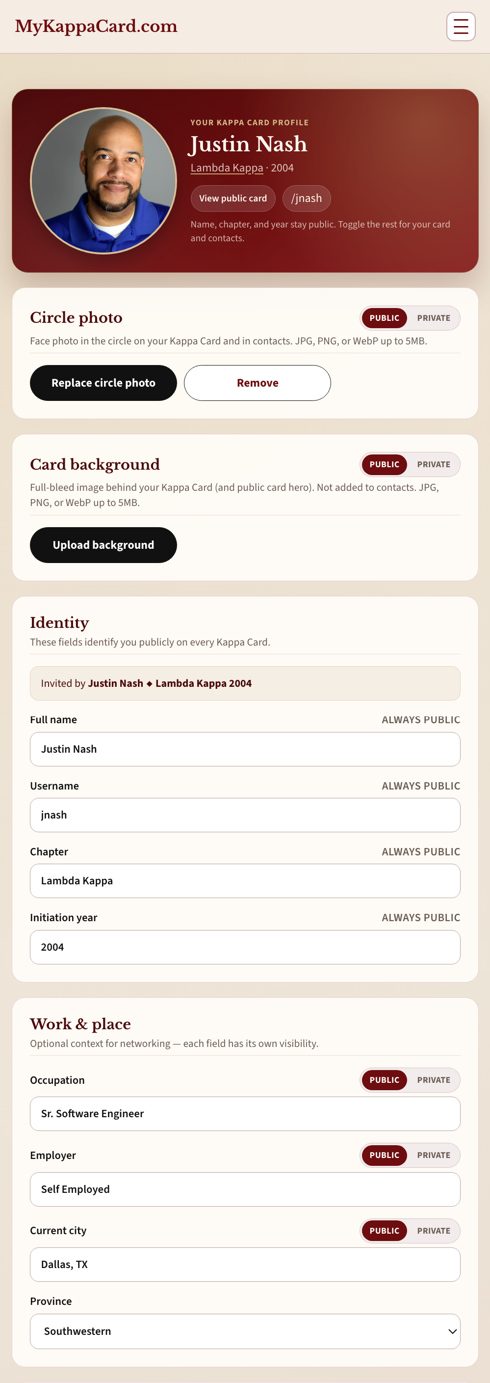
I started with the awkward moment rather than the feature list. The product had to work in a handshake, a hallway, or a reception line. That constraint eliminated a native-app-first path and pointed toward a web-based experience that could be opened immediately, scanned, and understood without instruction.

From there the work was product strategy, interface design, and development in the same thread: what information belongs on the card, how it should feel, and how little a person should have to do in order to receive it.


The Scan: open immediately, understood without instruction.
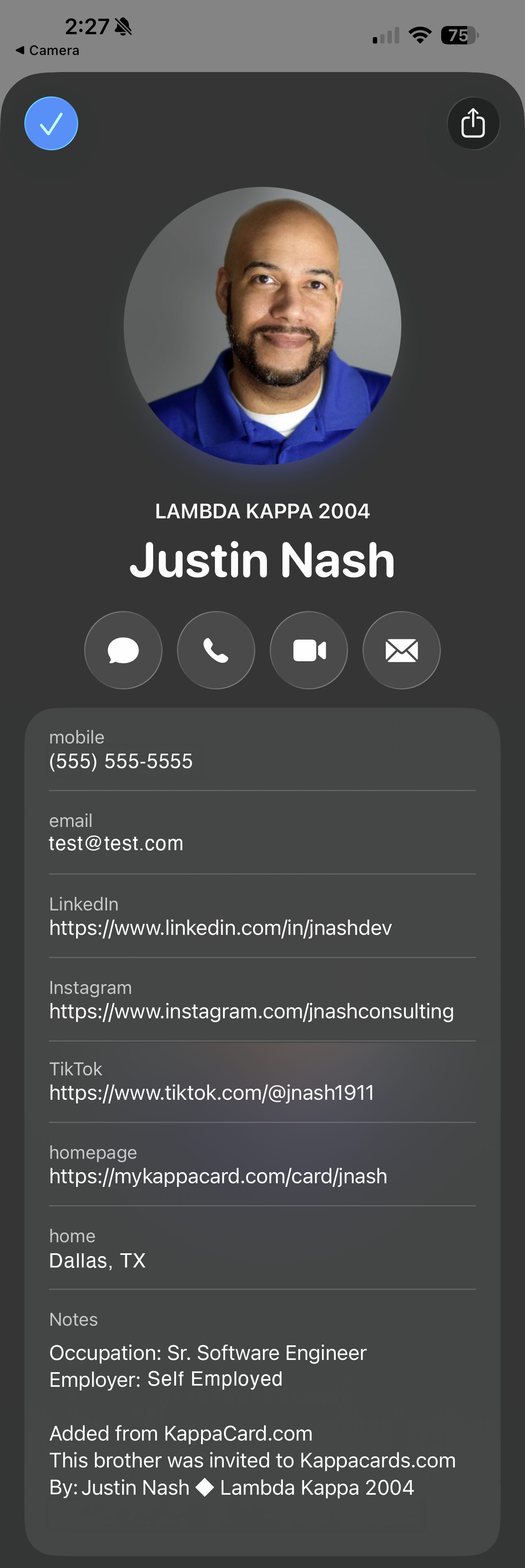
The Contact Card: complete contact information in one view.

The outcome

Kappa Card turned a fragmented exchange (phone numbers, social accounts, follow-up messages) into a single scan. The product is useful because it respects the people and the moment it was built for.

This is the kind of problem an Idea-to-Prototype Sprint is designed to clarify before a larger build.

See All Work

Get the idea out of your head, let's make it real.

Start a ProjectMore Work